Design Trends: 2017
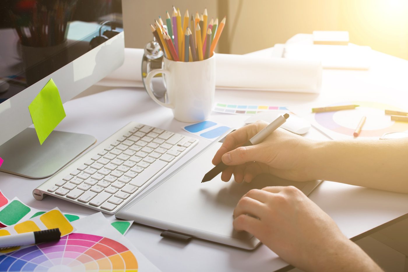
Six graphic design trends to look out for in 2017:
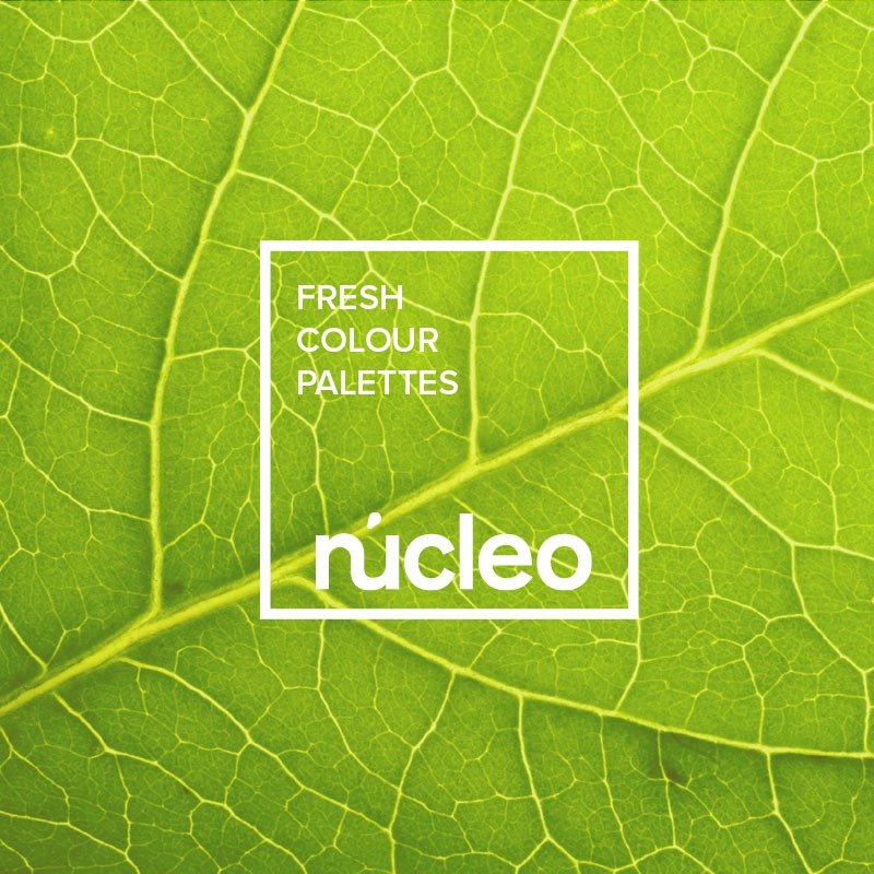
FRESH COLOUR PALETTES
This year will see a surge of ‘refreshing and revitalising shades’, according to the Pantone Color Institute, who have just named ‘Greenery 15-0343’ as their
Colour of the Year. Manifesting as a ‘fresh and zesty yellow-green shade that evokes the first days of spring’, Greenery is a versatile ‘trans-seasonal’ shade, able to be used for graphic design, product, fashion and beauty applications.
As well as Greenery, we can expect to see a range of rich, earthy hues, such as khaki, olive greens, brick red and charcoal grey, working together to create a textured aesthetic for 2017. Designs using this on-trend spectrum will be ideal for breathing new life into stale advertising.
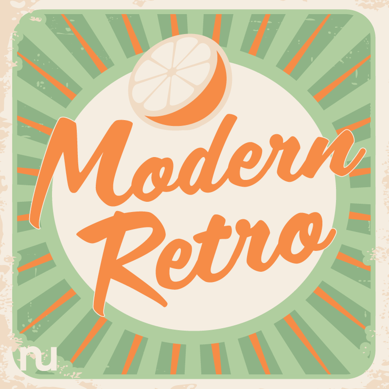
MODERN-RETRO
Modern-retro, as the name implies, has been around for a while. ‘Retro’ itself refers to the older design trends of the 1920s-70s, but modern-retro combines old with new. It revitalises old graphic classics with contemporary influences from more recent decades.
Finding its way into web design, company logos, product packaging, and more, modern-retro often takes stylistic influence from pixel art, early PC and video games, solar system or space themes, vinyl records, and the ‘50s diner motif. The modern-retro trend rose through the ranks in 2016, and looks set to grow in popularity throughout 2017.
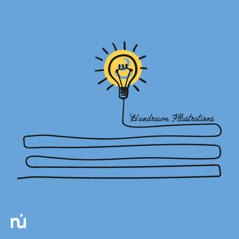
HAND-DRAWN ILLUSTRATIONS
Illustrated images play a powerful role in business marketing, as they can add an organic and undeniably human element to the design. They are also diverse: they can add warmth and authenticity to a brand; they can evoke a sense of nostalgia; they can be a cute or kitsch way of explaining complex processes; and so on.
Because hand-drawn images may be used in such a wide range of situations, we can expect to see them growing in popularity throughout 2017. The independent, unique quality they lend to creative design might be perfect for your brand.
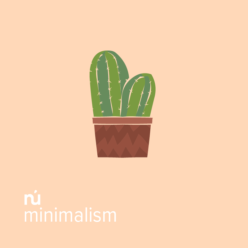
MINIMALISM
Minimalism has been on the rise in recent years, and looks to be here to stay for 2017. With a focus on simplicity and functionality, minimalist design is ideal for websites and other online processes.
The ‘less is more’ mentality of this trend often materialises as minimal text, intentional white space, and limited palettes of saturated and contrasting colours. All of this combined can help to create a clean, distinct style that clarifies the intended message or highlights the action desired from the viewer.
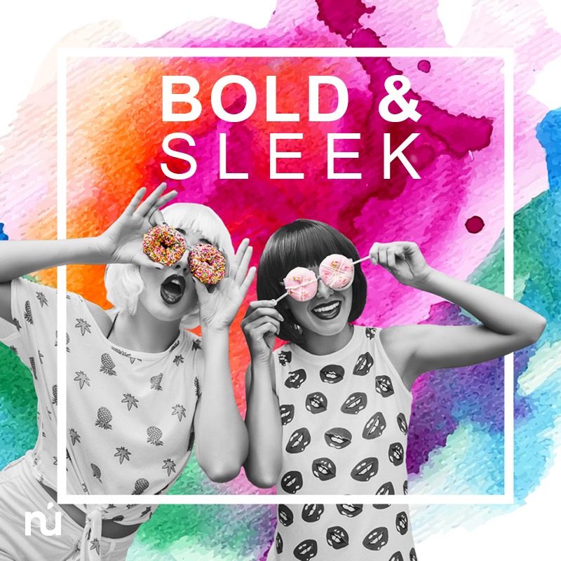
BOLD & SLEEK
Evolving from the success of minimalism, the combination of bold photography with sleek text seems to be gaining momentum for 2017. Similar to minimalism, bold and sleek designs are concise and uncluttered, but offer potential for some braver design choices.
This trend often features minimal white or black text (a sans serif font is most popular), sharp lines and borders (perfect for emphasising the information and drawing focus), and colourful, saturated or adventurous images (a sense of excitement is often the goal). This may be the perfect year for photographers, designers, and business owners alike to think outside the box.
CINEMAGRAPHS
Cinemagraphs are essentially still photographs that behave like a movie. They contain a minor and seamlessly repeated movement, forming a living element in an otherwise unmoving image. These are most often published as an animated GIF.
Cinemagraphs are an effective way of grabbing attention. The subtle artistry of these designs is made by blending the effects of a high-quality image with an identically-composed video. With marketers working harder than ever to stand out, you can expect to see more cinemagraphs online in 2017.