Welcome to NEWcleo
Yes, nucleo is sporting a fresh new look, complete with logo, website, and outlook for the future. We’re excited to have finally unveiled our rebranding, but some of you might be wondering — why?
First: some history
nucleo started out in 2008 as ‘Webcessity’, a software development specialist with only a handful of staff. But overtime it expanded, and was fully established as nucleo in 2013.
With the 2013 rebranding came the need for a different logo. Many options were considered, with that familiar maroon splotch ultimately winning out over the competition.
nucleo’s rebirth from Webcessity meant adopting a wide range of additional services. We were no longer only software developers, but also designers, marketing specialists, content creators, and more. That logo reflected these changes — it was reminiscent of both a spreading drop of paint (to symbolise our conquest into creative design), but also of a nucleus, a central core for activity and growth. Its rustic colours suited our quaint attitude and wholesome services.
At the time, that logo was perfect. But fast-forward three years, and we find nucleo to be a changed company.
No longer is nucleo a start-up marketing agency with quiet, quirky charm. We have evolved; we have taken charge of our fields; we have become confident and clever (and sexy as hell!).
Enter: the 2016 rebranding
Reasons for rebranding
A company may overhaul their brand identity for numerous reasons. When under new management, a fresh story can reflect the business’s change in direction. When a business has been around for a long time, a different look might indicate that they still have exciting things to offer. When a business experiences internal growth, rebranding can be the perfect opportunity to raise awareness of their name, show off their potential, and set them apart from competitors.
For nucleo, it was a case of the latter.
We actively explore and embrace changes to our industry, technology, and services. Our decision to rebrand was not simply about designing a new website or logo, but rather about communicating who we are and what we can do.
So again, why did we change our brand identity?
As a team, we agreed that 2013-nucleo and 2016-nucleo were entirely separate entities. Our business has transformed from a simple software development team, to a leading provider of marketing services. Wearing our nucleus-style logo, we worked alongside companies of all sizes from a variety of industries. But it became clear to us that our austere identity wasn’t communicating what we needed it to. nucleo has grown, improved, and innovated its services, but the old branding was a representation of our past — not a reflection of our future.
Our brand personality
The decision was made: nucleo needed a new brand identity to demonstrate our growing status as a reputable, full-service marketing agency. Our team put their heads together to discuss what nucleo is, and how we want to represent it — in other words, our brand personality.
We narrowed our attributes down to six core traits:
- Client-focused — We are driven by the success of our clients. Our commitment to them comes above all else.
- Clever — We constantly seek ways to learn, grow, challenge ourselves, and push the boundaries.
- Creative — We use out-of-the-box thinking to deliver an enviable ‘wow’ factor in everything we do.
- Passionate — We are devoted to our industry, jobs and clients, and that passion shows in our attitude and work.
- Fresh — We enjoy changing for the better, and offer our clients the latest and most innovative strategies.
- Weird — By injecting a little weirdness into our lives, we become more open-minded, resourceful, collaborative, and creative.
Then we needed the perfect logo to reposition our company and reinvigorate our identity.
The logo
Our designers collaborated their ideas with the rest of the team, and much debating was had. Did we need a symbol in our logo, or should the name itself suffice? Would we shed our skin of brown and maroon, and if so, what next? And there was much ado when one of the designer’s favoured fonts was revealed not to include the diacritic ‘ú’ we’d grown so fond of.
Many ideas were created, rehashed and rejected. But eventually, we zeroed in on a single style and polished it.
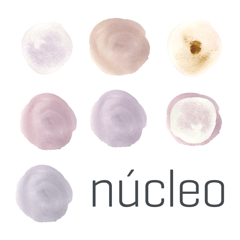
The logo brought to mind words like ‘seamless’, ‘sleek’, and ‘refined’ — all traits we attribute to our work. The ‘n’ and ‘ú’ flow smoothly into each other, creating an attractive ambigram. The consolidation of these letters also worked to draw your eyes to that all-important syllable ‘nú’ — or ‘new’, a contemporary representation of nucleo’s growth, and a nod to our mission for our clients.
The website
Redesigning the website with our rebranded story was the perfect opportunity to restructure our layout, content, and online-experience. We were able to clarify our services, categorise our posts, and provide a more informed message about our business.
Moreover, the website allowed us to show off our rebranded colour scheme: a complementary spectrum of six colours — for the six core services and six central values of nucleo. The pops of colour also worked to maintain our inherent ‘weirdness’. At nucleo, things are not merely black and white; we have an inherent ability to create the bright, the eye-catching, and the surprising.
The end result was a website that looks amazing and runs smoothly. After all, a seamless new look needs a seamless new site.
The launch
We wanted to provide our customers with a rebranding that was worth looking forward to. We built hype about the relaunch of our brand through our social media outlets: Instagram with a stop motion animation of the old logo being cut into pieces; and Facebook with a series of posts that incorporated the new colour palette and the theme of ‘change’.
Social media channels are a great way to incite excitement; this is where people go to connect with your business, and where changes are most likely to be welcomed and shared.
Now, with our rebranded identity taking root, we will continue to unveil it through display pictures, business cards, and, soon, maybe even a different office. (Shhh….)
Into the future we go
The nucleo rebranding of 2016 is more than just a design change. It is a revamped identity under which we can express who we are, what we are capable of, and the bold direction we are heading in the years to come.
We know our ‘nú’ look will only accelerate our company’s success, and we hope you are as excited about our ‘brand new’ story as we are.