Typography — not for the font-hearted
For most people, typefaces are a rather insignificant concern in the grand scheme of things. But all designers know that the quality, success and likeability of their work could hinge on their choice of font
You may not consciously realise it, but typography has a massive impact on how you perceive printed work. The chosen typeface, the size of the font, the kerning, the colour, and other creative tools each carry subliminal messages and hidden meanings that can significantly alter the look and feel of a design. As a business owner, you can’t afford to overlook this vital factor in brand awareness.
So here’s some important ‘infontmation’ about typography in design:
Where does font matter?
Where doesn’t font matter? Whether it’s for advertising, branding, logo design, promotional materials and more, the font selection is not a decision to be made lightly.
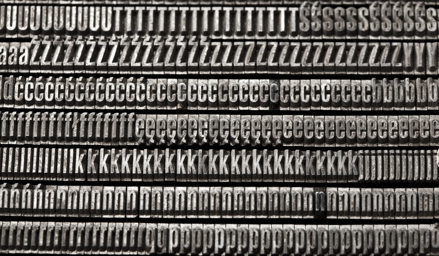
The basics:
When a nucleo designer gets to work, their minds immediately start tracing the roots of their typographic decisions:
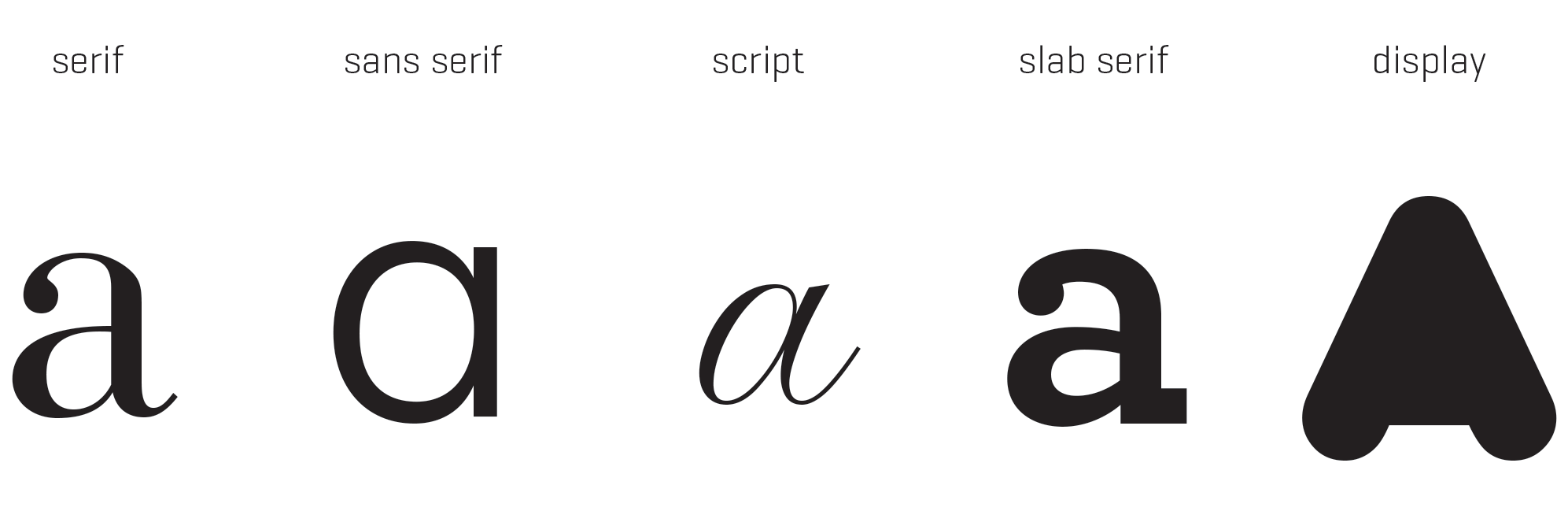
Style
At its most basic, style comes down to serif or sans serif. Serif fonts, like Cambria, are those with small hooks and tails; sans serif fonts, like Calibri, are those without them. Each has their own appeal for different situations.
Size
What type size will best convey the message of the design? A smaller font may mean more words in a restricted space, but are they legible? And what about the size of headings? Slogans? Fine print? Font size must suit the audience and complement the other elements of the printed work.
Contrast
A professional and eye-catching contrast can be created in numerous ways, whether this is by size or font weight or by a different complementing typeface. But mixing fonts can be risky business. When you mix and match different typefaces, you want to avoid small, incremental changes; juxtaposing Arial against Verdana, for instance, is such an insignificant contrast that viewers may be distracted by the question of whether or not they are the same. But nor is it as simple as picking two outrageously different typefaces. Often, two fonts will team well if they have a common trait; this could be a similar x-height or stroke weight, for example.
Needless to say, the nucleo team has a lot to think about.
The personality of fonts:
Typography is more than just letters on a page. Each font has character that can work to express a particular aesthetic taste, idea, or sense of individuality. Learning to identify and access these personalities is vital in portraying the best image of a business.
But wait — don’t go too far. Playing with font is an artform, and using ostensibly unique typography can be problematic. The key here is to find a balancing act: determine the distinction between expressive and stylish typefaces, versus fonts that are simplistic, useful and appropriate. In doing this, we can avoid designs that overpower the viewer, but still capture their attention.
But what determines personality? This involves the overall look of the font and its predetermined uses, but it is also a matter of personal choice. For instance, serif fonts can be viewed as professional or stiff, as classic or edgy, but are nonetheless competent, versatile, and suitable for a wide range of purposes.
Despite the varying perspectives, every good typeface has a voice. They may shout or they may whisper, but each has a message that, when used correctly, can elicit an emotional response from your potential customers.
The stereotypes:
The easiest and most visible indicator of a skilled design is the use of a professional font, and this means watching out for the most stereotypical typefaces.
Times New Roman is a classic choice; it is a smooth, easy-to-read serif font used in many situations — but not in creative design. Because of its presence across endless formats, the use of fonts like Times New Roman can connote apathy and ineptitude.
Another recognisable stereotype is Papyrus — a font so overused it has inspired entire blogs dedicated to its sightings in advertising and branding. It even popped up as the subtitle font in James Cameron’s Avatar, much to the horror of designers everywhere. Like Times New Roman, Papyrus is a system font, and thus should never be used in professional design.
And of course we mustn’t forget the reviled Comic Sans, a whimsical font used for everything from comic books (who knew?) to ‘Beware of dog’ signs. Overused, misused, and immediately recognisable — professional designers know that this is a font to avoid.
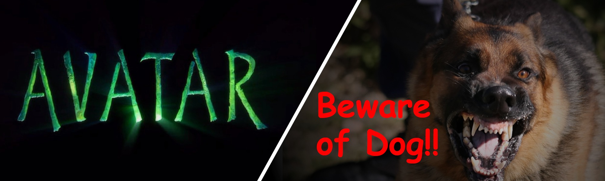
Avatar image from: james-camerons-avatar.wikia.com/wiki/File:Avatar_title.jpg
Nothing is ‘wrong’ with these fonts, per se, but proceed with caution. Usage of a stereotypical font can portray a business as unimaginative, uninnovative, or even amateurish.
Remember your audience:
Our final point is a big one — never forget who you are fonting for. A serious business can portray professionalism to its customers through crisp, classic typeface. Other brands might aim to express a friendly, bubbly attitude through soft and curvaceous fonts. There is no limit to the emotional range a font can reflect.
Some people think that typography in advertising doesn’t matter, but font can help your business achieve the best look with the best personality for the best design. Remember that even the smallest of details have the potential to make or break your brand.